

A school that had outgrown its website.
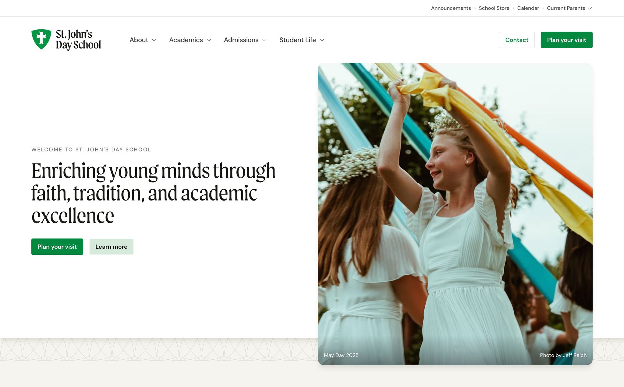
St. John's has taught children from the same Laurel home since 1950. More than 200 attend now, from age 2 through sixth grade, and every spring they still dance the Maypole.
Facebook had become easier than the website
The previous site went up around 2012 on a version of WordPress from the same era. It was good for its time — but the staff had turned over, the programs had changed, and the site still described a version of the school that no longer existed.
What made it urgent wasn't how it looked. It was what had quietly happened around it:
- Families were getting school news from Facebook, because it was easier than the website.
- The calendar was a downloadable PDF, usually out of date by the time anyone opened it.
- Updating the calendar or the lunch menu meant fighting the CMS, so it didn't happen often.
- Board requests to post news often went unfulfilled — there was no working process for getting anything published.
- On a phone, it was hard to use.
None of that is anyone's fault. It's what happens when a website stops being the easiest way to get an answer — people go find an easier one, and the school slowly loses its own channel.
Two navigations for two kinds of visitors
Everyone who arrives at a school website is asking one of two questions, and they are nothing alike.
“I need this right now.” A parent checking whether Friday is a half day, what’s for lunch, where the supply list went, or how to log into the reading portal already knows the school and wants an answer as quickly as possible.
“Tell me about St. John’s.” A family fourteen months from enrolling a four-year-old, who has never set foot on campus and wants to understand what seventy-five years of tradition feels like.
Most school sites serve both from a single menu. We split this one in 2: a utility bar across the top for the people who need something now — calendar, announcements, parent resources, giving, search — and a primary navigation underneath for everyone else: About → Academics → Admissions → Student Life → Plan Your Visit.
Once that split existed, the rest of the project followed. More than 25 pages became about 15 focused ones, individual academic subjects moved into logical program groupings, scattered parent resources became 1 dashboard, and several calendar pages became 1 calendar system.
Everything a current family needs, above everything else
The utility bar puts the calendar, announcements, giving, and search in one place, along with a Current Parents menu for portal logins, the lunch menu, and forms.
None of it is buried in a submenu, because a parent standing in a school pickup line at 2:45 shouldn't have to navigate an admissions funnel to find out whether there's after-care tomorrow.
The school year, in your phone, instead of a PDF
The school year used to be a downloadable PDF that went stale the moment anything moved.
It is now close to 200 events across 5 categories, all filterable, browsable, and subscribable, so a parent's calendar app updates when the school changes something. The school maintains it directly, which was the measure of success set at the start: staff updating the calendar and menu independently, without technical frustration.
Start with the question every parent asks first
Before a parent wonders about tuition or traditions, they want to know one concrete fact: what grade would my child even be in?
So that's the first interaction on the homepage. Enter a date of birth, get a placement — a child's path through St. John's, K2 to sixth grade, mapped in one click. It costs the parent nothing, requires no email address, and turns an abstract “someday” into a specific year.
5 independent school sites in the South, read closely
Before we designed anything, we studied how 5 independent schools in the South organized information, moved families toward enrollment, and separated daily tools from storytelling.
The review confirmed several useful patterns: a homepage that summarizes the whole site, 3 clear calls to action instead of a menu of a dozen, numbered enrollment steps that make the process easier to understand, and photography of students doing the things the school describes. It also showed the value of keeping daily tools apart from the storytelling, which became the basis of the 2-tier navigation.
Those patterns gave the board and our shop a shared reference before we made design decisions.
A voice the school can keep using
The site captured one moment in time. The more durable work was documenting the voice St. John's already had. Without that reference, thirteen years of small decisions had slowly pulled the old site in different directions.
So alongside the copy we delivered a voice and tone guide: the school's four voice attributes, separate tonal guidance for prospective families, current parents, and staff, a preferred-word list, and a before-and-after set showing the same sentence written badly and written well.
Before: “St. John's Day School's comprehensive early childhood education program utilizes developmentally appropriate practices to facilitate optimal learning outcomes for students aged 3-5.”
After: “Our preschool program is designed around how young children naturally learn — through play, exploration, and plenty of hands-on activities.”
It also says what not to say: no “pedagogical,” no “leverage,” no “rigorous,” and — for a school — no “excellence,” “premier,” or “award-winning.” The guiding line was that St. John’s should sound like “a conversation with a trusted friend who happens to be an experienced educator.”
The brand green is named after the Maypole
Alongside the site we tightened up the school's identity, starting with the logo. The green in the codebase is called --color-may-day-green — named for the school's oldest and most important day.
Only developers see the name, but it keeps the school's institutional memory inside the system that future developers will change.
One set of facts for every kind of search
The goal was blunt: when somebody in the Pine Belt asks about private schools in Laurel, St. John's should be the answer.
We modeled the school as 1 connected entity, made the site available to major search and answer-engine crawlers, and gave those systems the same facts a parent sees when asking about private schools in Laurel.
A deliverable the board could approve at every phase
We ran this in phases with named deliverables at each one, because a school board needs to approve things and a small office needs to know what’s being asked of it and when.
Inspiration & insights — 5 independent school websites in the South, read closely for mechanisms rather than looks.
Discovery — stakeholder interviews, a content audit, a requirements document, a prioritized feature list, and a project timeline.
Design & planning — a navigation prototype, visual designs, a content organization map, a technical foundation plan, and a content migration roadmap.
Build & launch.
Success was defined before design started, per audience: staff updating the calendar and menu independently; parents using the website instead of social media; prospective families getting a clear path from interest to application.
A single enrolled family is worth more than $5,000 a year, and a family that stays from kindergarten through sixth grade is worth many times that.
Organic search standing improved after launch, and the school finally has analytics worth reading.
The operational result is harder to measure and probably bigger: the calendar, the lunch menu, and the supply lists moved off the front office's desk and onto pages that update themselves.
Technical details
The CMS deploys independently of the site.
Payload runs at cms.sjdslaurel.com rather than mounted inside the app, so publishing and deploying never block each other and a CMS problem is never a website problem.
Media on R2, transforms at the edge.
Originals live in Cloudflare R2 with no egress fees, while the image pipeline still negotiates AVIF and WebP per browser. The school gets lower media costs without changing what visitors see.
One third-party script on the entire site.
Plausible is the only third-party script: no Google Analytics, tag manager, or pixels. The site needs no cookie banner or consent manager, and it collects no data on children's families that the school did not ask for.
Type scales with the viewport.
A custom modular scale at a 1.25 ratio sets the hierarchy, and the section rhythm changes with the available space.
- Built with
- Next.js 15, App Router
- CMS
- Payload, deployed on its own subdomain
- Media
- Cloudflare R2, transforms at the edge
- Hosting
- Vercel
- Third-party scripts
- One — Plausible, and nothing else
- Fonts
- DM Sans, Calluna, and Moret, self-hosted
- Routes
- 22